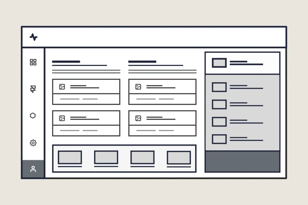
What is whitespace?
I should start by saying that whitespace (sometimes called negative space) doesn’t have to be white. It can be any color. It simply refers to the space surrounding elements within a design.
Used in conjunction with good hierarchy, correct color ratios, and consistent design patterns, whitespace magically elevates design efforts by highlighting key information for the user.
Many non-designers overlook whitespace because it doesn’t seem functional. They can’t ‘see it.’ But in reality, it’s the glue that holds good design together. Ignore it at your peril!
Why whitespace matters in SaaS design
The ability to scan an article, website, or app is taken for granted until it becomes an effort. Whitespace makes it easier for users to scan, focus their attention on, and find information relevant to their needs.
Whitespace also helps create a natural hierarchy within your designs. It organizes content into sections, which guides users’ eyes through the screen. For example, adding additional whitespace to a button makes it easier to find and read (with the appropriate font, color contrast ratio, and padding). This reduces users’ time and effort in deciding if an action will help them complete a task. Without this space, you force users to think more about the options before them.
Whitespace elevates perceived quality
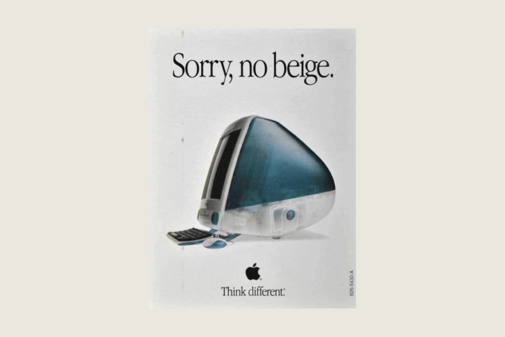
Everyone loves to talk about Apple and their product design. After all, they’ve created some of the world’s best-loved products. However, something rarely mentioned is their use of whitespace. Most consumers couldn’t tell you what they find so appealing about Apple’s marketing materials, so I will, at least as it relates to this post. Unsurprisingly, it’s their use of whitespace.
Look at the example image below. Your attention is immediately drawn to where Apple wants it, and nothing else is needed. Outside of forming an opinion, you don’t have to think. All the thinking has been done for you (this can also be seen as manipulation).

Businesses that use whitespace effectively tend to be perceived as more polished, modern, and premium.
Whitespace encourages user engagement
Whitespace reduces overwhelm by reducing clutter and keeping users focused. If users are focused, they’re more likely to stick around. And if your app is intuitive and easy to navigate, you may see an uptick in paying customers.
How to improve whitespace in your SaaS
Go through your SaaS screen by screen, and take note of any areas that feel crowded. Here are a few questions to ask yourself:
- Are users given too much information at any point?
- How many options or choices are available to users at any time?
- Does this screen look like a wall of text/content?
- Can this screen be better organized?
- Can this screen be redesigned to help guide users more effectively?
- Can this scree be removed altogether?
- Do I need to rethink the app’s information architecture?
In-house UX audits can be problematic. You know how to work around existing problems; these workarounds become second nature to you over time. This makes it difficult to see issues faced by new users.
If you’re looking for professional help, I’m passionate about supporting founders with my UX reviews!
Use a grid system
Consistent design doesn’t get enough screen time, and it’s one of the most common failings in SaaS design. Grid systems provide consistent structure and prevent developers from reinventing the design wheel (sorry, guys). It doesn’t matter which system you use; use one.
Design for hierarchy
Decide what’s most important on each screen and use whitespace to highlight those elements. For instance, leaving additional space around a call to action will help it stand out. Users want to be led, so lead them. Good hierarchy helps answer questions such as ‘What’s important here?’ ‘What actions can I take?’ and ‘Where do I go next?‘
Whitespace and hierarchy go together like strawberries and cream.

Test with real users
One of the biggest Aha moments of my career was after launching my first SaaS in 2013. We weren’t getting great results, so I ran some user tests. It was, hands down, the most valuable thing I could have done with my time. It’s possible to learn more in a few days of user testing than in months or years of trial and error. Not all users are made equal, so make time to run usability tests. See what users have to say, make changes, then check again. Keep doing this until… Just keep doing it.
Push past the fear of empty space
Many founders and non-designers feel the need to fill every inch of the screen. On the one hand, giving users as much information as possible makes sense, but it can also lead to mental fatigue. Forcing users to sift through row after row of content probably won’t have the desired effect.
Think of whitespace as the air that helps your content breathe.
Summary
If you’re unsure whether your SaaS is doing a good job guiding users, now’s the time to do something. A few simple changes can dramatically improve usability and retention. Need some help? My Full SaaS UX Review will help you identify whitespace opportunities and much more.
If you have any questions, feel free to get in touch. I’m here to help.

Get free weekly tips on making your customers happier with better UX. From onboarding to activation and beyond—no fluff, just actionable insights to help your SaaS thrive.