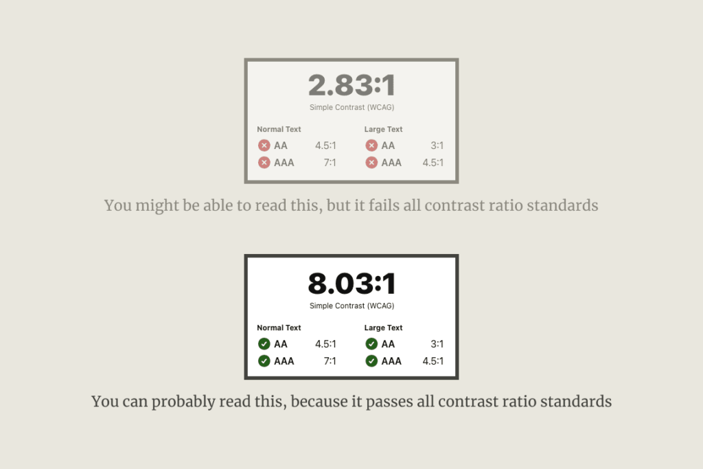
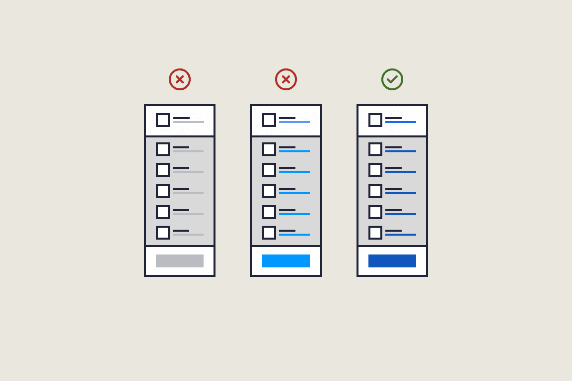
Ninety-nine percent of the SaaS apps I review fail to use sufficient contrast to pass accessibility standards. If this was due to poor design choices or an uneducated designer, we could argue for a while and move on. But, given the bold title of this post and the sheer number of SaaS that ignore accessibility altogether, we should dig deeper into why color contrast ratio is important to the survival of your business.
What is low contrast ratio?
According to the WCAG, ‘Contrast is a measure of the difference in perceived “luminance” or brightness between two colors.’
This means that when the contrast ratio between two colors is too low, the page fails to meet WCAG standards. More importantly, it alienates a significant portion of users.
The flawed thinking of many designers is, ‘If I can see it, so can our users.’ But if there’s one thing that being a senior UX designer teaches you, it’s that you are not your user, no matter how much you want to be.
’ But, Nathan, we copied this design straight from (insert your favorite app). All the big players use this look.’
The sad thing is that you are correct. Many of the world’s biggest SaaS businesses fail basic accessibility standards. Read that again… Many of the world’s biggest SaaS businesses fail basic accessibility standards.” These standards include the use of proper contrast ratios. And you know what? Some of them have paid the price, literally. But more on that shortly.

The real-world impact on users and your SaaS
The World Health Organization states that 2.2 billion people have visual impairment. This is slightly less than the combined population of India and China!
‘Come on! Visual impairment is on a scale, and the small percentage that wants to use my SaaS is insignificant.’
But if we’re only talking about numbers, are they insignificant?
What’s your signup rate, initial churn, LTV, etc.?
If you could improve those numbers by one or two percent? What would that mean for your bottom line?
Low contrast can be a direct barrier for some and a source of frustration for others. Why a source of frustration? Prolonged eye strain means additional concentration is needed to perform simple functions. This leads to user frustration, which tends to compound. So, combine difficult-to-see elements with an inconsistent user experience and subpar onboarding, and BOOM! You’ve lost another potential customer. Multiply this by X, and you are bleeding money.
If we want to get down to brass tacks, I should also mention the possibility of a lawsuit. Even the smallest of fines could put you out of business. If you doubt this, do a search for ‘minimum penalties for WCAG infringement.’ It’s frightening!
Easy ways to improve contrast ratio
I could talk about the correct ratios established by the WCAG, but you want actionable advice.
So what can you do?
The general standard is to check all background and foreground colors on your website, signup screens, and SaaS app with the WebAIM Contrast Checker. It will tell you if an element passes or fails. This can take a while.
Some browser plugins can diagnose poor contrast ratios without checking each element individually. This is a big timesaver.
The two browser plugins I use in my UX reviews are:
- The confusingly named AInspector
- WCAG Contrast Checker
- Stark
And, of course, plenty of plugins are available for your chosen design software.
Sadly, many founders refuse to make changes after their business is up and running, as these changes affect their branding, or it’s simply too much work. “There are more important things.” (Response from a client’s UX review). This alone should be enough reason to work with an experienced designer from the start.
This brings me to the easiest fix: Hire an experienced designer specializing in SaaS design.

Conclusion: Don’t let low contrast ratio kill your SaaS
As a founder, I know accessibility can be low on your to-do list. Most don’t even know that low contrast ratios are part of accessibility. But hopefully, after reading this post, you’ll see that it’s more than just a poor design choice.
In my UX reviews, fixing low contrast is always at the top of the low-hanging fruit list. It’s relatively quick and easy, and a minimum investment can increase your bottom line. Also, it’s nice to be one step closer to avoiding an accessibility standards lawsuit.
So, grab a coffee and check your web and app with one of the contrast checkers mentioned above. If you prefer that an expert tell you exactly where your SaaS is letting you down and how to fix it, check out my UX services.

Get free weekly tips on making your customers happier with better UX. From onboarding to activation and beyond—no fluff, just actionable insights to help your SaaS thrive.