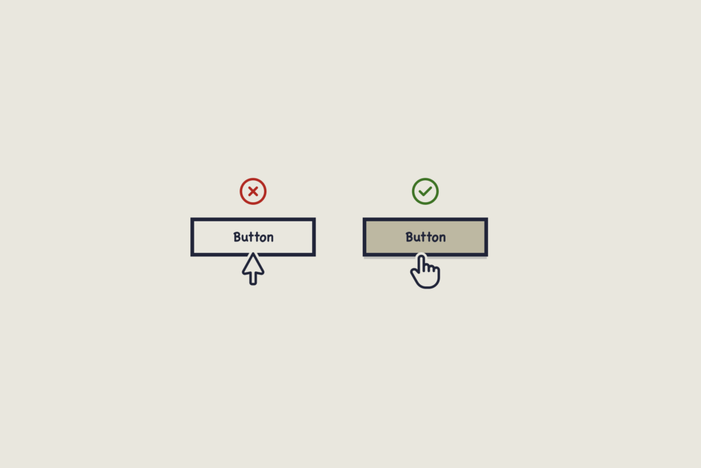
We experience interaction and feedback loops from the moment we wake to the moment we sleep. They are the online version of action-reaction.
The most common example of an interaction and feedback loop is one we take for granted. What happens when your mouse (cursor) moves across an interactive element? The cursor changes from an arrow to a hand. This lets you know something is happening, about to happen, or will happen if we click. It’s an interactive element. This is an Interaction and Feedback loop. Action – Reaction.

This most basic of interactions is so ingrained that we pause momentarily when it fails. If an interaction doesn’t work as we’ve learned it should, we are forced to think.
‘What’s wrong? Is it broken?’
‘What have I done?’
Steve Krug’s popular book on UX wasn’t called, ‘Don’t make me think,’ for nothing.
Using inappropriate or confusing feedback is also a common problem.
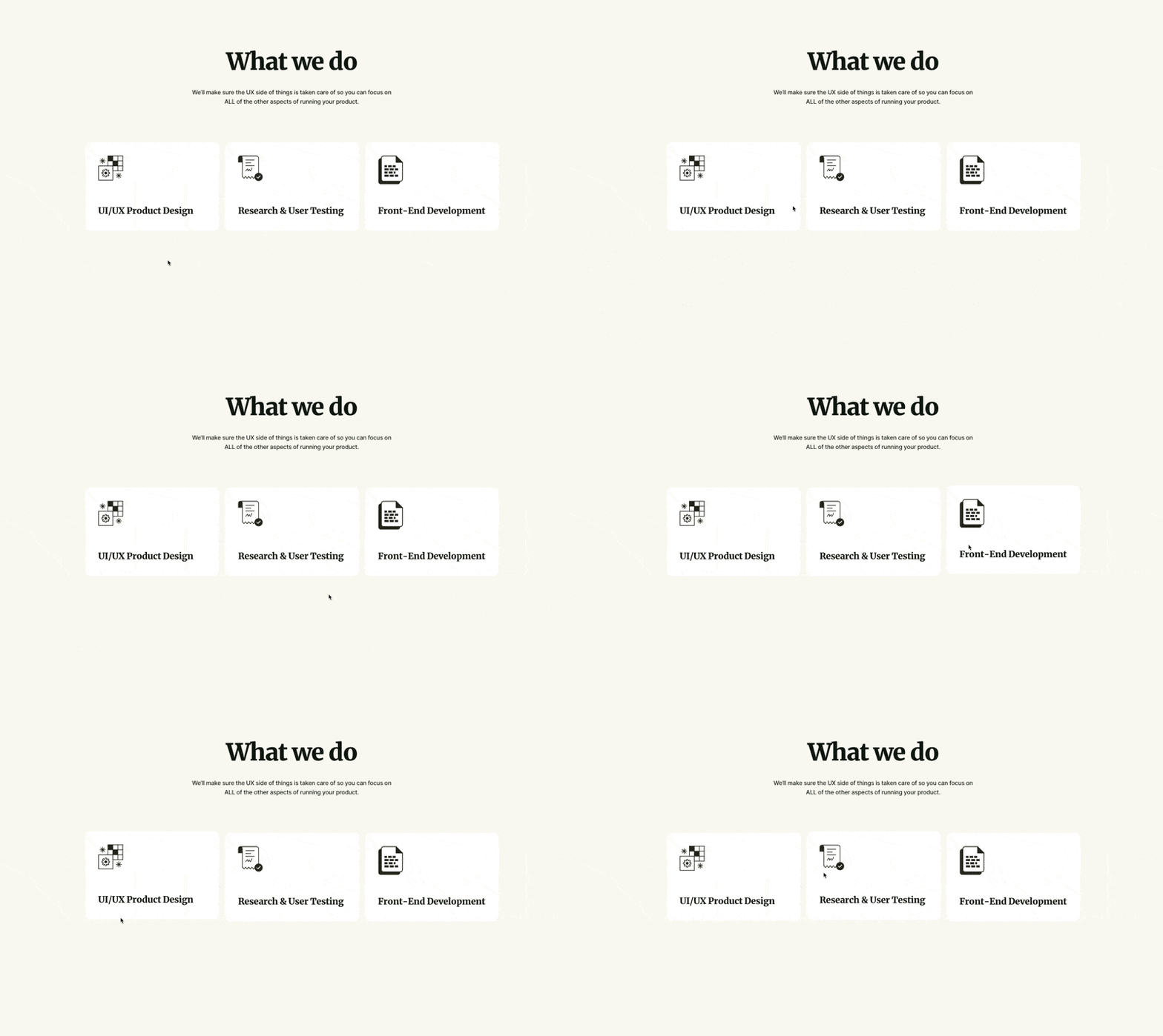
In the gif below, the interaction tells users something is happening, about to happen, or will happen… but nothing does. It’s an animation. This is a poor UX choice. Why? It leads to user confusion, in this case, mine. I stumbled across this poor interaction-feedback loop on a UX agency’s website. If there’s a chance for confusion, why risk it?

The larger problem of Interaction and Feedback loops
Trust is a fickle thing. From when potential users hear about your SaaS to the day they begin a trial, weeks or months can pass. During that time, they may have downloaded a lead magnet, read your blog, engaged with your social media, or watched a webinar or two. After putting so much effort into attracting new users, seeing them churn in minutes can be soul-destroying.
It’s unlikely that inconsistent Interaction and Feedback loops will be the sole reason for churn. However, they are usually part of a bigger problem: Design inconsistency.
Small design inconsistencies compound over a new user’s journey. Pile up enough of them, and you will lead users straight to the door.
Some common problems that share screen space with inconsistent interaction and feedback loops are Low contrast ratios, lack of hierarchy, inconsistent design elements, and poor use of whitespace… to name a few.
It’s not just spectacular, app-crashing bugs that send users running for the hills; it’s also the harmless inconsistencies that chip away at trust, causing users to lose faith in your SaaS.
Common interaction and feedback loops
Here is a short list of common interaction and feedback loops. If users receive feedback that doesn’t fit the interaction, doubt creeps in, and seeds of frustration are planted. We don’t need to reinvent the (design) wheel.
Interaction: Hovering over a button.
Feedback: The button changes state to indicate that it is an interactive element and not merely decorative. Expected feedback could be a change of color, shadow, or opacity. Side note: If the subsequent action takes longer than expected, additional feedback should be given to help the user understand what’s happening.
Interaction: Hovering over an image that may be difficult to see or understand.
Feedback: The image displays an ALT text. In the context of SaaS, ALT text describes images, improving accessibility for visually impaired users. If no ALT text is found, these users cannot experience your SaaS as you or they would like.
Interaction: Submitting a form with errors.
Feedback: Typically, if an error is found when filling out or submitting a form, feedback is given in red-outlined fields, error messages, or inline hints explaining what needs to be corrected. We’ve all suffered the frustration of hunting for an error when a form fails to save or send.
Interaction: Hovering over an icon.
Feedback: A tooltip or ALT text will appear if no additional text is used with the icon. Side note: Icons without context are not recommended. Clarity over Cool, always.
Interaction: Completing a form successfully.
Feedback: A success message appears (e.g., ‘Your data has been saved!’), and the form fields may clear or redirect you to another screen.
Interaction: Clicking a toggle switch or checkbox.
Feedback: The cursor will change to show that the element is interactive. The toggle visually flips (e.g., changes color or slides), or the checkbox gets a checkmark to confirm the selection.
Interaction: Dragging and dropping an item.
Feedback: The dragged item follows the cursor, highlights the target location, and snaps into place once dropped. Feedback should also inform the user that the item has been saved, uploaded, etc.
Interaction: Loading content or processing an action.
Feedback: A loading spinner, progress bar, or skeleton screen appears while the action progresses. If these interactions take longer than expected, additional feedback should be given to assure the user everything is OK.
Interaction: Deleting or performing a destructive action.
Feedback: A confirmation message is displayed to verify the action. Once the user confirms the action, a success message or visual indication that the item has been removed is shown.
You might be thinking, ‘Nathan, this is all so obvious. We see these things every day.’ And you’d be right! So imagine how your users will react if their most basic expectations aren’t met.
Why does the interaction and feedback loop matter?
1. Predictability builds trust.
When learning something new, we look for patterns. These patterns help us understand how something works without being shown. Let’s look at an example: You click the ‘Save’ button on two separate screens and experience different feedback on each. One shows a ‘saving’ progress bar and a success message when done. The other simply refreshes the page. Your work is saved in both cases, but which loop generates trust?
2. They reduce cognitive load.
Yes, cognitive load is a UX buzzword, but it’s also real. Consistent interactions are key to reducing users’ cognitive load or helping them think less. If a user pauses to figure out how your app works, it adds friction and asks them to think more. In this scenario, thinking is bad.
3. They improve the user experience.
Here’s the bad news: You won’t get praise for using consistent interaction and feedback loops. Users won’t notice when things work. What they will notice are inconsistent loops. Unexpected feedback can throw users off, even if only for a moment. Give your customers a great user experience by making sure there’s nothing to complain about.
How to fix broken Interaction and Feedback loops.
Choose the right design system
The easiest way to have great interaction and feedback loops is to get ahead of the problem. Choose (or design) a design system that gives you everything you need, now and in the foreseeable future. I see too many systems hacked together in my UX reviews. Future-proof yourself where you can.
Run a UX review
We all do the best job we can when designing software, but certain problems go unseen by the team building it. As your business grows and features are added, cracks appear. And here’s the kicker: even if you have excellent product sense, you’ll only see some of them. You’re too close to the problem. Get an external, impartial UX review of your SaaS and have a professional show you where there are issues and how to fix them.
Make time for user tests
Regular user tests can’t be beat. You’ll learn more in a morning’s work of testing than in months, possibly years, of best guesses. When I launched my first SaaS in 2013, it was user tests that took things to the next level. Until then, I never took testing seriously. You should. Organize your first batch today!
Summary
The first few minutes of a new user’s journey are crucial. If things aren’t right, the trust you worked so hard to establish can vanish before you’ve opened the ‘New Signup’ email. So, whether you’re in the early stages of business or ten years in, investing in sensible UX is a must. Don’t let your users down with inconsistent interaction and feedback loops.
If you’re interested in running a UX audit but don’t know where to start, get in touch. I’d love to help your SaaS become consistently great and, of course, more user-friendly!

Get free weekly tips on making your customers happier with better UX. From onboarding to activation and beyond—no fluff, just actionable insights to help your SaaS thrive.