Your SaaS signup flow works 24 hours a day, 7 days a week. It’s the first interactive experience a new user has of your product, and even at this early stage, it’s full of make-or-break moments. Nail it, and you’ll get more trial users. Screw it up, and they’ll disappear before experiencing the 134-click guided walkthrough you have waiting for them… I kid, I know you wouldn’t have that!
According to Heap, up to 64% of users drop off during a typical SaaS signup flow. That’s two-thirds of your potential customers gone. Two thirds! Why? Signup flows are often overcomplicated, unclear, invasive (too nosey), and too long.
In this guide, we’ll look at:
- Best practices for SaaS signup flows
- Common mistakes in signup flows and how to fix them
- Examples and actionable fixes
Let’s jump straight in!
Keep your SaaS signup flow short and sweet
While there’s a valid argument for friction in some instances, you don’t want to push new signups through countless screens. Every additional step or field in your signup flow increases the likelihood of drop-off. But, by how much, I hear you ask.
• Signup forms with 3 fields or less see a 25% conversion rate.
• Add more fields, and it drops: 6+ fields? Just 15%. (Unbounce Study)
Side note: While studies and statistics evolve as user habits shift, the core principles tend to remain true.
Actionable fix: Ask for the essentials, such as their email address and password. Leave anything else, such as their job title, company size, etc., for later. If in doubt, ask yourself, “Does this help me or the user?” If it’s the former, ditch it.
Real-world mistake: Asking for too much upfront.
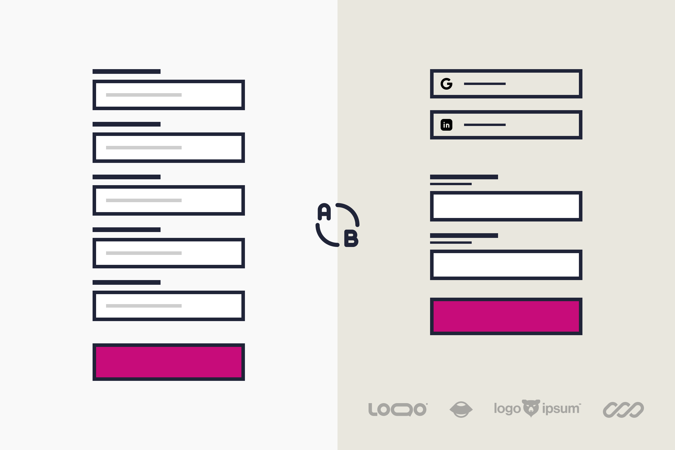
Below is an example of a SaaS signup form that asks for the first and second name, email address, password, and phone number. And it’s one of two screens!

What’s wrong with this form? In many cases, it’s too much. The form is long, it’s set over multiple screens and these fields feel invasive, particularly for individual users who don’t represent an organization. Keep it simple.
In the image below you can see a simplified version of the same signup screen. It’s missing nearly all of the original fields, but that’s OK. If you need the extra information you still have the onboarding phase. First, focus on getting users in.
- Password
- Social Signup

Add social signup options to simplify the signup process
Nobody enjoys filling out forms. I know I don’t.
Social signup options like Google, LinkedIn, and X allow users to create an account in seconds, bypassing the headache of creating yet another username and password.
Why social signup works:
- Users already have social accounts.
- It’s fast and frictionless.
- Password reset emails become a thing of the past.
- It reduces drop-off caused by prolonged, annoying signup forms.
Remember: If users use their preferred social signup method, don’t force them to fill out extra fields afterward. That would defeat the whole purpose. If you implement social signup, do it well.
Common misconception: SaaS founders used to worry that Gmail signups indicated less serious users. However, the broad adoption of social signup has assured the majority that this isn’t necessarily the case. Committed users will engage with your SaaS regardless of their preferred signup method.
Don’t ask for a phone number unless …
Unless your business model relies on manual onboarding, forget the phone number. Mandatory phone numbers are a conversion killer for almost anything other than Enterprise businesses. Users will likely resist and either drop out of the signup flow or use a false number. Only a few users will want to speak to your sales team at this early stage.
When to ask for phone numbers:
- If phone verification is critical to your SaaS product.
- If you offer a phone-based demo or onboarding.
- If you are focused on enterprise customers.
Outside of these three reasons, leave it out. If you must ask for a phone number, make it optional.
Build trust with social proof
If someone is on the fence about signing up, social proof can give them the nudge they need, particularly if they recognize customers or the brands that already use your platform.
What to include:
- Testimonials from happy customers
- Recognizable client logos
- Quick wins or metrics, like Join 10,000+ teams using ”Insert Your Product Name.”
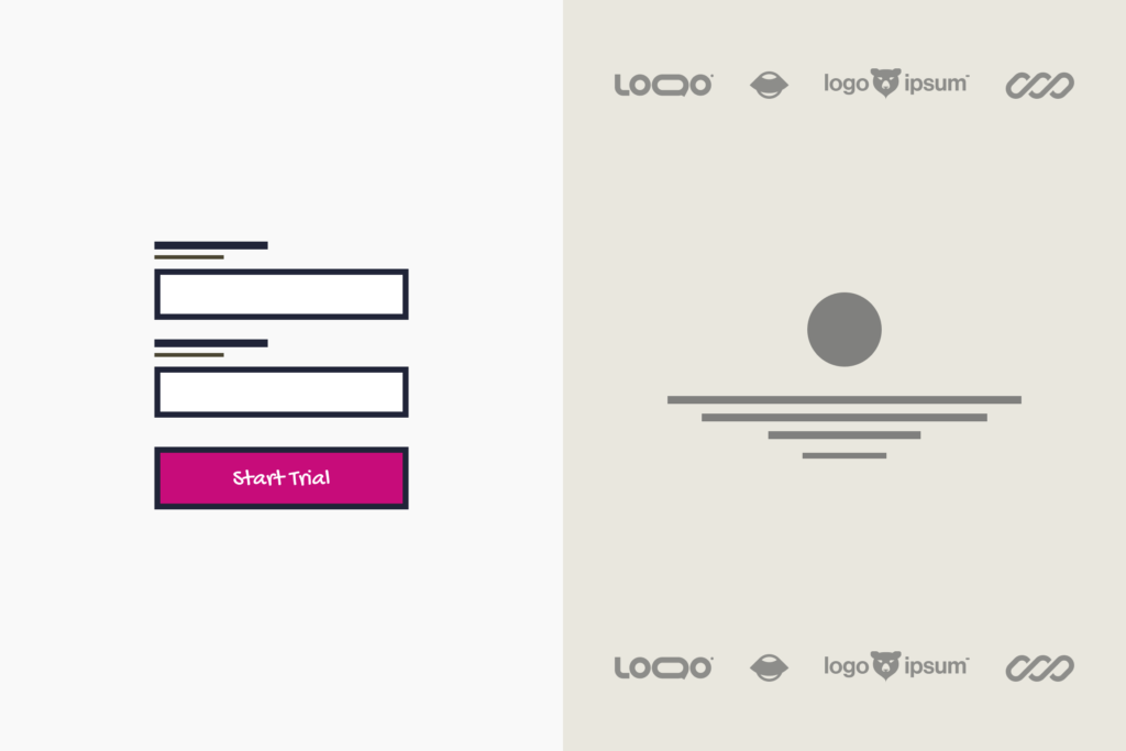
Below is an example of a SaaS signup page that uses social proof to boost confidence in new signups.
Why it works: People trust people, especially when we can put a face and name to them. Use that trust to your advantage!
Using captchas in your SaaS signup flow
Captchas exist to keep out bots, but they also do a great job keeping out some humans.

The problem: Asking users to identify fire hydrants or bicycles feels like a chore. It feels like a chore because it is. It’s repetitive, breaks signup momentum, rarely works the first time, and is a general source of frustration.
Here are some alternatives, although none are foolproof or perfect.
- Use a simple checkbox: “I’m not a robot.”
- Add Honeypot fields: This adds an invisible form field that real users won’t see. Bots will often fill it out because they scan all fields in the form. So, if it’s filled out, you have a bot!
- Use email validation after signup: This can be frustrating if you’re kept waiting. An alternative to this alternative is to let users in and request validation before any meaningful interaction takes place, such as “Send a mass email to 600 contacts!.”
- Time-based validation: Bots will fill out a form instantly (unless trained otherwise), whereas humans are slower. If the signup is too fast, you can flag it and say goodbye.
- ReCAPTCHA v3: This is Google’s invisible captcha system. It works using Google’s risk score based on each user’s behavior. While this is frictionless, it does carry the usual Google privacy concerns.
Focus on getting users in, not testing their patience.
Basic form usability
We often think of form design as something simple. So simple in fact, that we don’t give them the time and attention they deserve. The core of your users’ signup experience hinges on the design and usability of your forms. Here are a few form design errors I commonly see in my UX Onboarding Reviews.
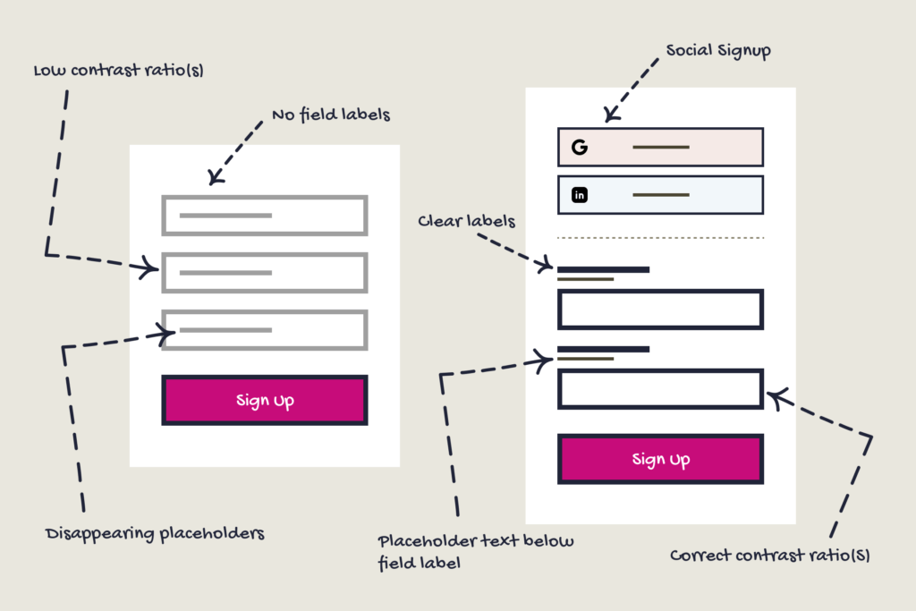
No field labels: Welcome to the world of trendy design. Designers mistakenly presume that a two-field form doesn’t need labels. However, once a user clicks inside, the placeholder text disappears. If the user is distracted or not paying attention, they have to delete any text they’ve written, click outside the field, and start again with the placeholder text in view…again. Not good!
Placeholder text: We all know how important placeholders are. They give hints as to what information a field requires. If they are so important, why do we have them disappear? Place them below the field label and have them always visible. Clear is the new cool, not the other way around.
Show errors where they occur: If there’s an error when submitting a form, don’t force users to hunt it down. It’s very frustrating. Show them exactly where the issue is and outline how it can be fixed.
Don’t misuse inline validation: Use inline validation only after a user has completed a field. Being told that an email address is invalid until the final ‘M’ of .com is typed is likely to have users throwing tomatoes at the screen. Give them a few seconds…
Use the correct color ratios: The proper color ratios should be used throughout your form designs. This includes field labels, field borders, placeholder text, field text, and secondary action buttons. Don’t be swayed by trendy design patterns. Your users will thank you.
Summary
Your SaaS signup flow is the front door to your product. The more welcoming it is, the more signups you’ll likely see come through it.
Take action today:
• Audit your current signup flow.
• Identify points of friction.
• Apply these best practices to increase conversions.
Small improvements can have a significant impact on your bottom line!
If you’re interested in examining your onboarding, I can help. My full UX review service goes in-depth on the new user experience. I’d love to help your SaaS become consistently great and, of course, more user-friendly!

Get free weekly tips on making your customers happier with better UX. From onboarding to activation and beyond—no fluff, just actionable insights to help your SaaS thrive.