Case study: Feature Upvote
Incremental UX improvements to Feature Upvote


“I highly recommend Nathan’s product design retainer service to any SaaS founder who doesn’t have the funds or workload to justify a full-time designer but needs an experienced and empathetic design expert.
Nathan’s product design retainer service has been a godsend. As a former SaaS founder, Nathan understands the business needs behind our design requirements.
The truth is, as a non-designer, I struggle to express my design requirements clearly. So, Nathan’s open collaboration and iterative design approach are very important to me.
Steve Mcleod
Founder, Feature Upvote.
An introduction to Feature Upvote
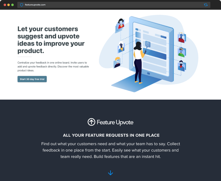
Feature Upvote started life in 2017 as the answer to an internal problem. Unable to find a suitable solution, the Barbary Software team developed a useful feedback and upvoting tool—lucky for them! Recognizing its value, they offered it to others, and as of 2023, Feature Upvote serves customers across the globe.
Barbary still uses Feature Upvote to collect and prioritize their own feature requests. Ongoing internal use ensures they have firsthand experience of their software as end-users…This does, however, create a problem that is synonymous with dogfooding your own products. And this is…
The challenge.
The closer you are to a solution, the harder it is to see where it falls short. As founders, we know our product like the back of our hands. As such, we know how to get from A to B and reach the desired outcome. In the case of Feature Upvote, this was creating and managing customer feature request boards.
It’s common with developer-led software that a product reaches a feature breakpoint over time. Adding new features can add complexity that users never signed up for. Some customers learn to deal with these changes, and some don’t. While I typically see this issue more with developer-led teams, it’s not exclusive to them. It also happens to startups with design teams.
But there is an important distinction that separates Feature Upvote from others, they reached out to a seasoned product designer. Me. 😊
The problem.
Feedback boards are the star attraction at Feature Upvote. Boards are where end users request features and upvote existing feature ideas. The internal view of this feature is referred to as the ‘moderation’ or ‘admin’ view. While end users don’t see or interact with it directly, it’s heavily used by Feature Upvote’s direct customers. This makes it an important screen.
Some of the issues that were brought to my attention were:
The image below shows the original version of a feedback board, which was the Moderate view.

The process
While many designers salivate at the thought of redesigning a SaaS, Feature Upvote’s founder, Steve McLeod was clear that he wanted to make incremental improvements. If you want to learn more about the reasons and use cases for incremental improvements instead of a complete redesign, Steve and I discussed this on the long-running podcast Bootstrapped.
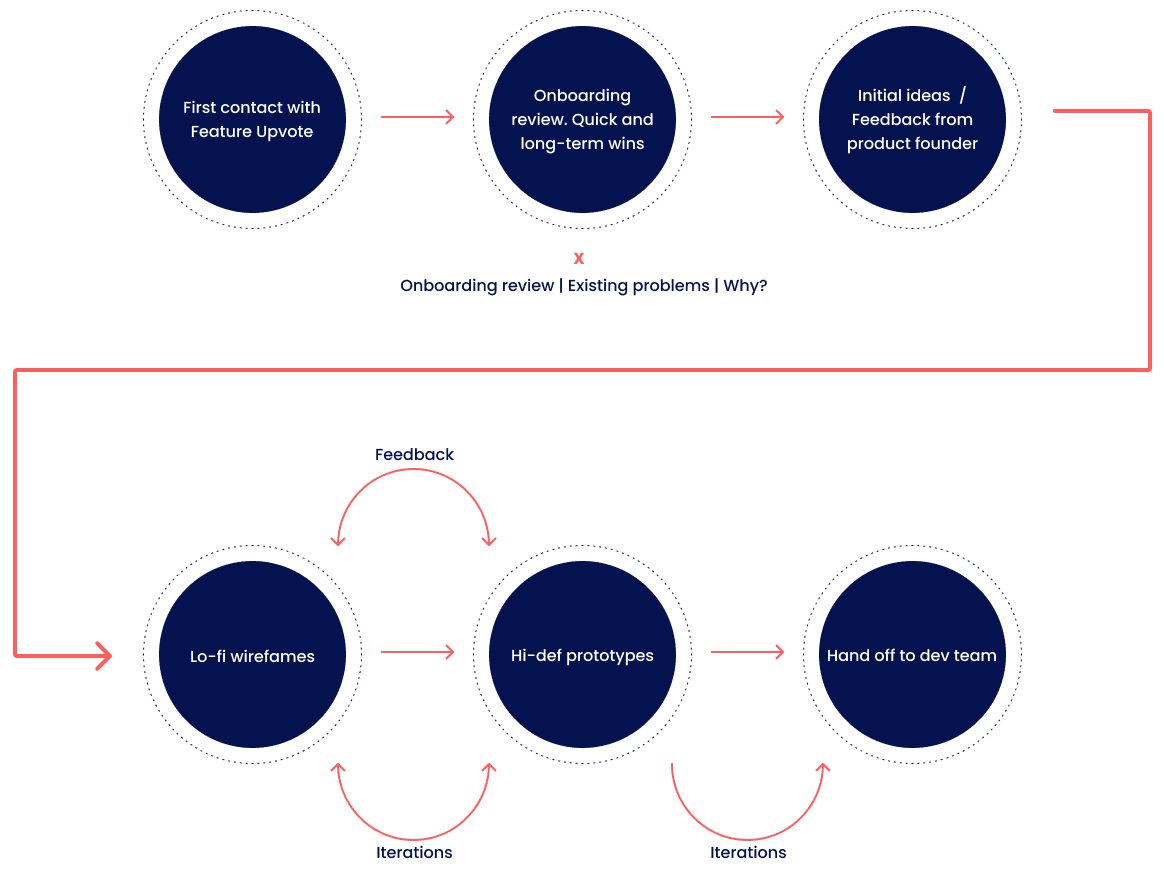
My process when working with Feature Upvote (and any client) was one of collaboration and iterative design. While I’m a seasoned product designer who’s also been a founder, no one knows more about their business than the founder or team. It’s my job to bring them into my work process so they can help me to help them. (Side note: Feature Upvote is a client of my design retainer plans ).
Before commencing any work, I always conduct an onboarding review. Onboarding reviews highlight any immediate problems within a SaaS. Perhaps more importantly, my clients get fresh insight into what potential new users experience during sign-up and while taking their first steps. Believe it or not, this customer testing and research stage is often overlooked. Even if a client is aware of certain problems within their app, watching someone struggle in areas that you thought were simple can be a tough pill to swallow. However, this initial point of contact with a customer’s software is crucial. After Steve watched my video review and sent his feedback, we were able to prioritize some quick wins and establish longer-term goals.
In the image below, you can see how my iterative approach applied to working with Feature Upvote.

Additional problems
The problem with making changes to a successful SaaS… is that you’re making changes to a successful SaaS! Inevitably, some users won’t be happy with the changes, regardless of the results. If you remember the (in)famous redesign of Slack in 2020 or even the recent Spotify changes, you’ll know what I’m talking about.
Changing how customers interact with your software brings consequences… and opinions. You hope these opinions are positive, but this is one of the main reasons I generally favor incremental improvements. To hear more about why incremental changes are the preferred choice, check out my podcast interview on B2B SaaS design.
Project expectations
To work with a successful business means one thing: Tread Carefully. Breaking a few eggs to make an omelet isn’t an option. However, the expectations were simple: Improve the usability of existing features and overall structure without alienating customers.
The idea of simplifying what is essentially a table seems straightforward until you remember: THIS ISN’T A REDESIGN. (By the way, there is an old yet very relevant article from A List Apart about this topic. It’s called Redesign or Realign.) I had to make the system more intuitive, preferably without customers noticing any major changes.
The iterative process
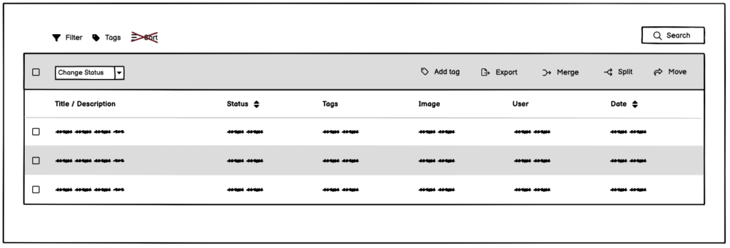
Sometimes, you get lucky and hit on a winning idea in the first round of wireframe sketches. This does happen, but not always. As you can see from the wireframes below, it took several iterations. The oh-so-important back and forth that many designers fear is at the heart of what makes iterative design work. Also, using a tool like Balsamiq to create wireframes removes distractions and helps clients focus on what’s important.
Be concerned if your designer’s first thought is to jump into a high-definition design. By the way, this makes a retainer ideal for founders. You never have to worry about design costs changing from month to month, regardless of how many iterations it takes.


Results and final thoughts
At first glance, it may seem that the changes are minimal. And you’d be right. The goal was to make life easier for the user with minimal disruption to their workflow. We hit that goal, and Feature Upvote founder Steve is very happy with the results. It’s always a challenge to balance what’s best for the user and what looks best. You only have to check out sites like Dribbble to see great-looking user interfaces that are unusable in real-world B2B situations. Time, experience, and working with the right client make this possible. The right designer also helps.
If you want to see the end result of my work with Feature Upvote, go check out their product and tell Steve I sent you 😉
If what you’ve read has piqued your interest and you’d like to discuss a project or idea, feel free to contact me here.

Your dedicated UX studio without the studio salary.
The average salary for a product designer in the United States is between $75,000 and $119,000. Not everyone can commit to such numbers.
Beyond the Pixel makes UX accessible to growing SaaS businesses without the commitment or cost of a full-time employee.