
This week, I had to notify my daughter’s school that she would be absent for her first three classes. These day-to-day interactions are done through a third-party, ‘centralized school management system.’ According to the company that runs the software, it has more than 2 million users—more than enough to run some user testing… or so you’d think.
I use the app semi-regularly, so I’m somewhat familiar with its bad UX. But until now, I hadn’t experienced the nightmare of justifying an absence for specific classes.
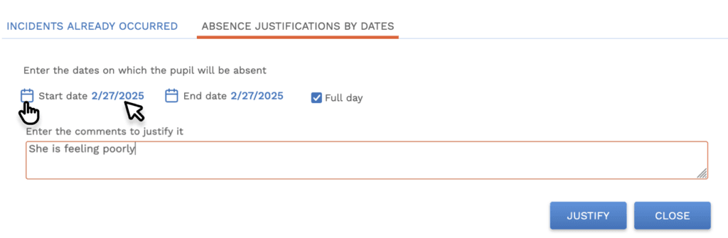
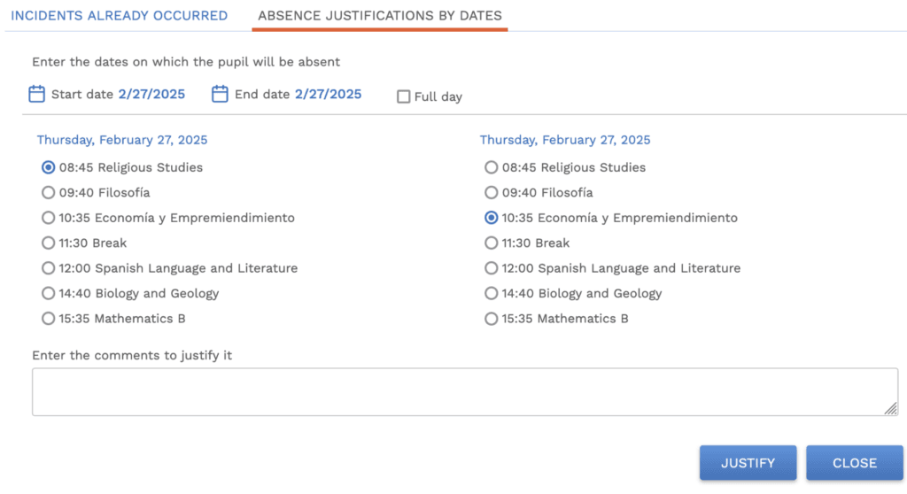
After logging in and clicking Justify, I arrived at the screen. While I want to focus on one particular UX catastrophe, let’s take a moment to appreciate the sheer number of missteps in this initial interaction.
What you see is a collage of several interactions from the same screen:
A quick breakdown:
- Blue is everywhere. Blue is commonly associated with links, but when you use it as the primary color and apply it to everything, it creates confusion.
- Inconsistent interactivity. The calendar icon triggers a date picker, but the date doesn’t. When both elements are styled identically, how should users know which performs a function?
- Equal button weight. The buttons have the same visual importance. Are they both primary actions? Plus, they’re way off to the right—far from the relevant input fields.
- Poor button contrast. A gradient background with white text? Not a great choice for accessibility.
- Red means error… or does it? The red outline on the text area suggests I’ve done something wrong—but I haven’t. It turns out red means focus. They also use red to indicate an active tab, but curiously, error messages revert to blue.
And now, let’s talk about the real issue.
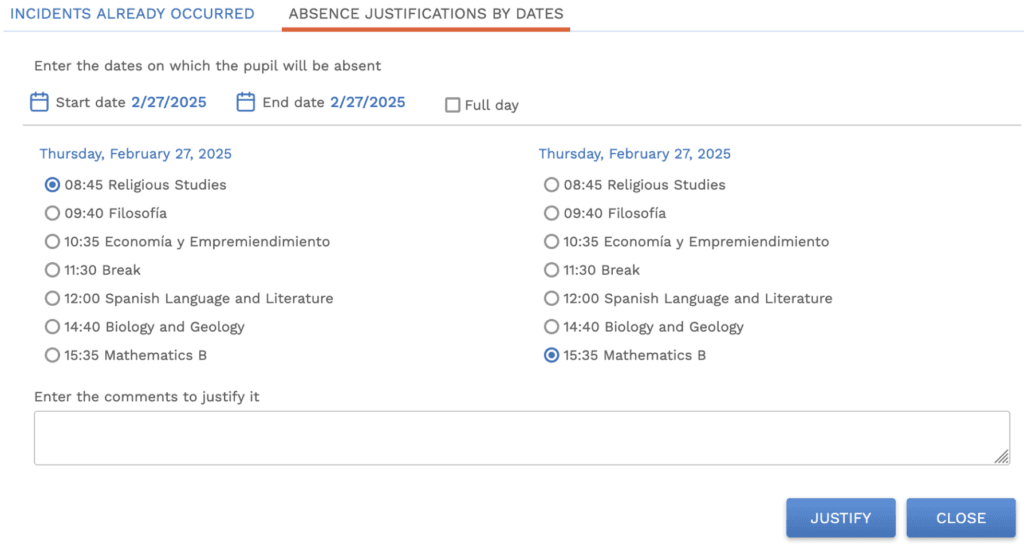
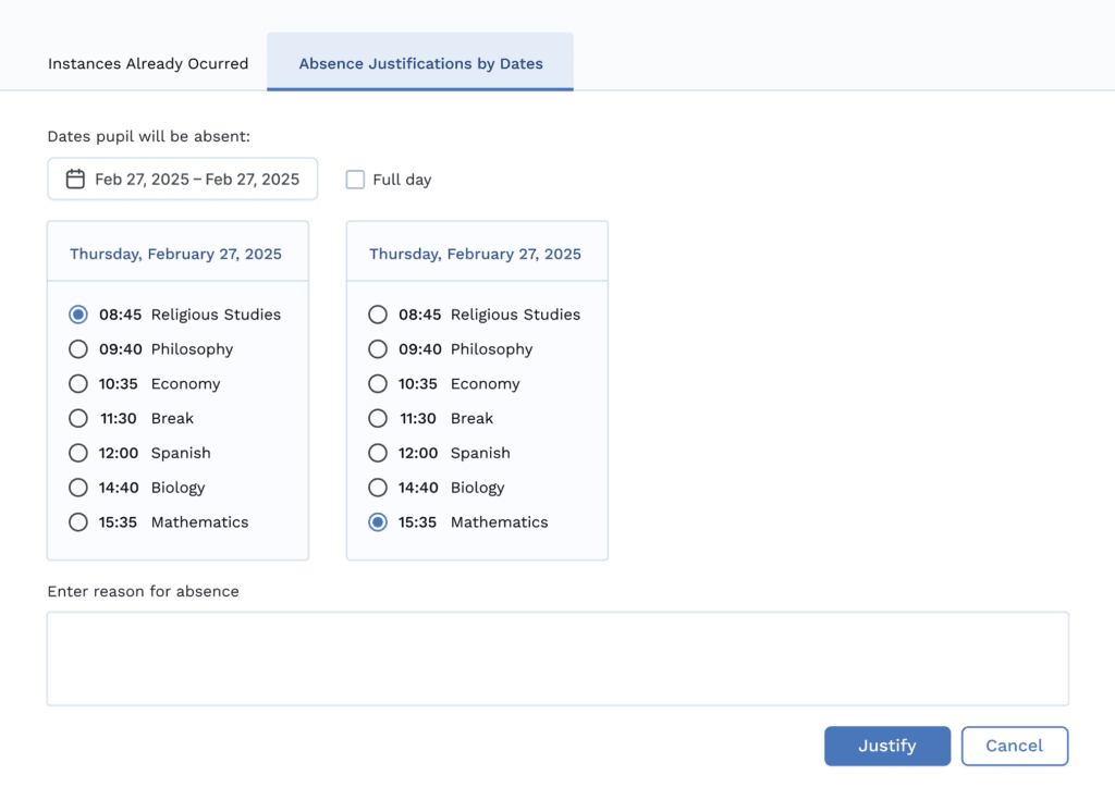
As you can see, the Absence Justification screen shows two identical columns for the same day. Same content, exact times, same everything. Oh, and there are radio buttons in both columns. WTF?!
Radio buttons can only function as an either-or element. However, I needed to select three different classes on the same day, so I hope you can see why I struggled.
After several failed attempts to outwit their UX, I got so annoyed that I considered talking to the school on the phone! Don’t worry; I soldiered on.
What happens when users encounter a dead end, a problem they can’t solve?
- They get click-happy. They click away furiously, stumble upon a solution, and, if lucky, work out how they ended up there.
- They urgently need a solution and contact support. Now, your team has to deal with an issue that shouldn’t exist. And they’d better be quick to respond!
- They leave. And unfortunately, that might be the last time you see them.
Typically, I like to go with option three. But since my daughter isn’t changing schools until next year, I was stuck.
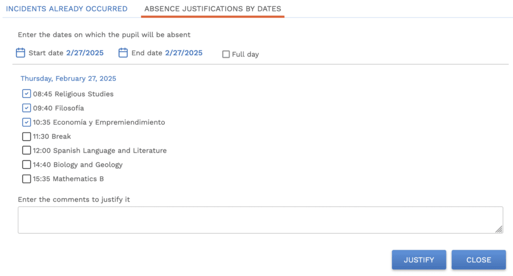
So, how did I resolve my problem? I got click-happy.
On a whim, I checked the box next to Full Day and then unchecked it. I noticed that the first class in the left column and the last class in the right column were pre-selected. When I clicked Justify, a modal appeared listing all classes that day and requesting a reason for her absence.

It was here I saw through the matrix. I understood what the UX minds behind this software had done. They’d created a multi-column range-pickerof sorts and executed it in the least intuitive way possible.
How I cracked it:
- Clicked the first class in the left column.
- Clicked the third class in the right column.
- Entered a reason, clicked Justify, and boom. My crowning achievement as a UX-designer-parent.
The takeaway:
- Don’t play god with your design systems.
- Run user tests.
- Seriously, don’t invent design systems. Users have never seen an interaction like this and won’t see it anywhere else. Bin it.
Standardized design systems exist for several reasons, but the one we care about here is familiarity. When a user understands how something works in one app, they should be able to use that same knowledge in another without having to relearn. Designing custom UX solutions without clear justification (get it?) isn’t just frustrating—it’s a massive waste of time and resources.
So, how could this experience be improved?
Soapbox time
For a surprising number of designers, UX is more like a religion than a field of study. They cling to one true set of beliefs. Anything that falls outside of those beliefs is hailed as blasphemy. At the very least, you’ll get a good scolding on social media.
To these designers, I say: Get over yourself.
Good design isn’t one-size-fits-all. It depends on the software, the user, and use case. Yes, best practices should guide us, but mindlessly following rules without context is dangerous and expensive.
I’ve spent 12 years working with highly profitable, ugly duckling SaaS businesses (plus another 8 in visual design). During this time, I’ve developed what I call ‘The Sliding Scale of (good) Design.’ The philosophy? Small, measurable improvements can have a staggering impact on your business.
OK. Sermon over. I’ll step off my soapbox. Let’s talk about how to fix this absence registration hell.
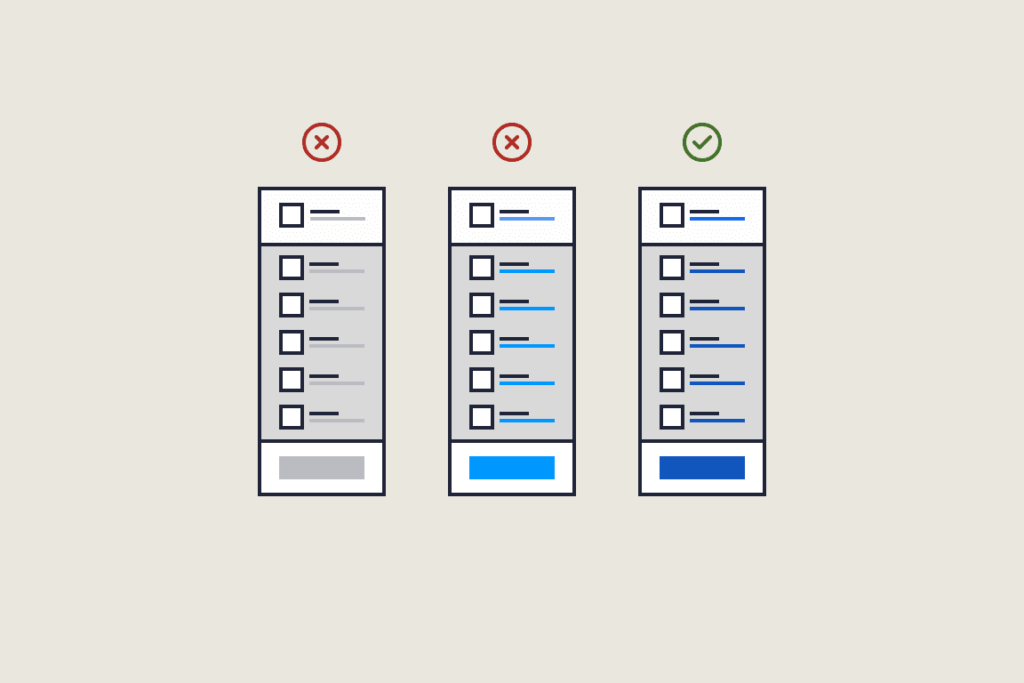
The boring checkbox
The checkbox is the digital equivalent of a potato; It’s plain, unexciting, and has been around forever. It’s a bit meh. But it works, and who doesn’t love chips (fries)?
The fix:
- Remove the redundant right-hand column.
- Replace the radio buttons with checkboxes.
That’s it!
This tiny change eliminates visual clutter and brain breakage. Even if a user has never seen a checkbox before (unlikely), a click or two makes its function obvious. There are no hidden interactions or surprises, just a practical solution requiring zero redesign.
The grid layout
If you wanted to get fancy, you could use a grid layout mimicking a class timetable. Users could select/deselect cards representing individual classes.

It’s not terrible, but it has issues:
- Forces users to scan across the full-screen width.
- Provides little indication of selection for visually impaired users.
A checkbox would fix that… so why not just use checkboxes?
Predefined options
- Full Day Absence
- Morning Only
- Afternoon Only
- Specific Classes (via dropdown)
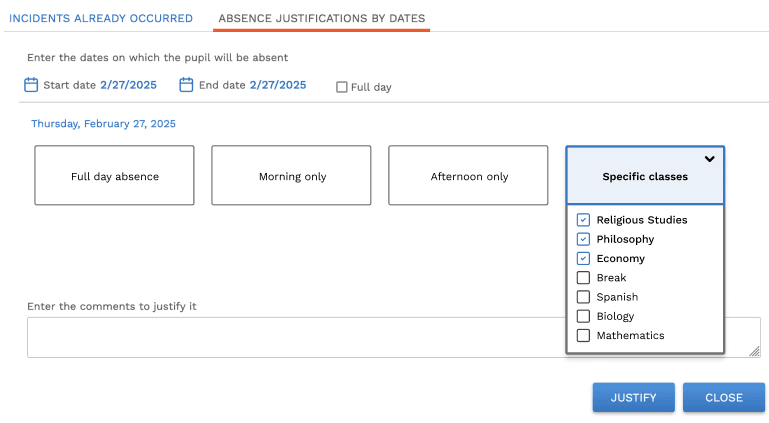
It’s better than the current system but still not as simple or effective as a straight-up checkbox list. Why hide important options if they are easy to display?
A new UI won’t fix bad UX
Any designer worth their salt will tell you that UI and UX are inseparable. Get both right, and you have a stellar experience.
But here’s the thing: you can have great UX with a bad UI and still succeed. The reverse? Not so much. Users won’t stick around long if your app is visually appealing but miserable to use.
Polishing the UI doesn’t solve fundamental UX issues. You’re just throwing money at the problem without actually fixing it.
Instead, apply The Sliding Scale of (good) Design and ask yourself: What’s the smallest, most impactful change you can make to your app today?
Not sure where to start? I can help.

Get free weekly tips on making your customers happier with better UX. From onboarding to activation and beyond—no fluff, just actionable insights to help your SaaS thrive.